Anyone here a Love Actually fan? I mean really, there is nothing like watching a cute 10-year-old run through the airport to the “love of his life” to get you into the holiday spirit and remind you that at the holidays … anything is possible. Even making a website that makes you feel like dancing through your house like this…
The trick as a designer is not always in the nuances of the design itself but knowing what language to speak so that you create something that turns out looking original AND beautiful… and not like you were speaking a different language the whole time… which does happen. #cringe
So in all of our fave examples below, we give you our tips on how you can make something similar using Weeknight Website. With us, you never have to feel like tech hates you and you are out of your depth with the design you fell in love… anyone else been there too?
Check Out Our Favorite 2019 Website Designs Below
Seasonal Favorite
Kristen Loves:
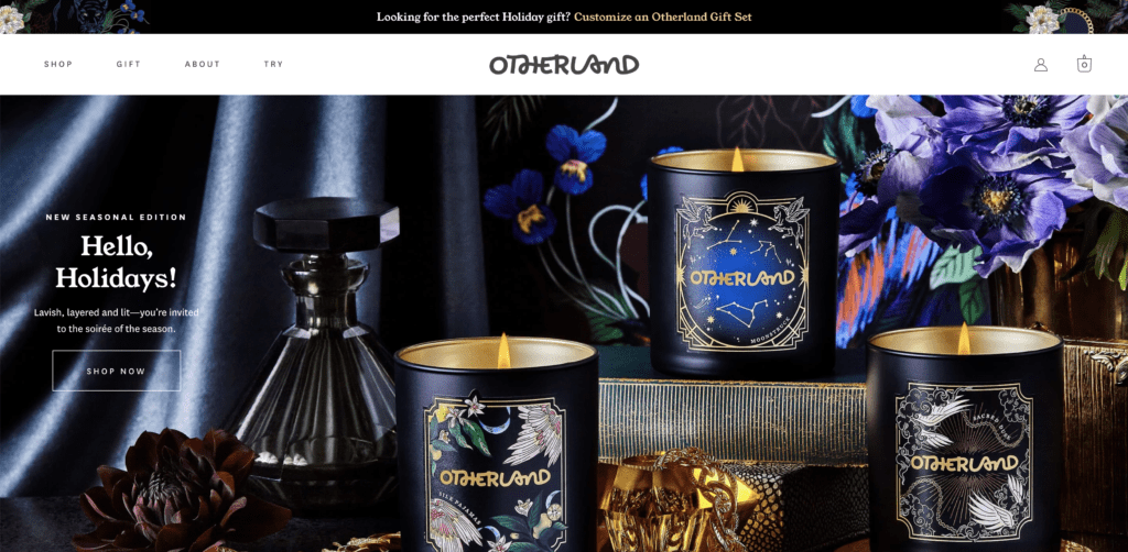
This brand is BOLD but set against a muted cream and black color palette, with careful pink and gold details and a retro font, you don’t feel overwhelmed by it. I love the use of animations as you explore the product pages. So delightful!
Make something like it on Weeknight Website…
- Pick a groovy font on Creative Market and use the Custom Font plugin to add it to your site as your header fonts.
- Create your Shopify store and use the Weeknight Website Shopify integration to make beautiful product pages and categories.
- Enable hover transitions on your buttons
Best Homepage Award!
Bucketlist Bombshells
*Built with Weeknight Website*
Kristen Loves:
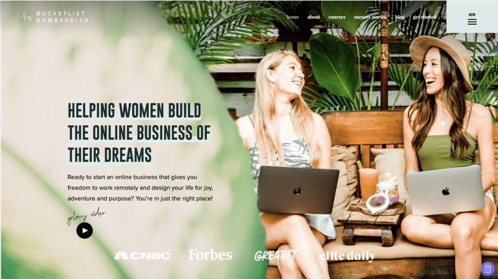
I worked on this website in the Spring of 2019 with the Bucketlist Bombshells and we had a lot of fun reimagining their existing brand and color palette for the site. There are so many aspects to the brand and we wanted to showcase that in every detail. With all the options to create custom feeds, affiliate product galleries, and blog layouts, we had a lot of fun!
Make something like it on Weeknight Website…
- Use negative margins to float objects on top of each other when desired
- Create a quiz on your site!
- Use the Instagram module at the bottom
Most Fun!
Jenessa Wait
*Built on Weeknight Website*
Kristen Loves:
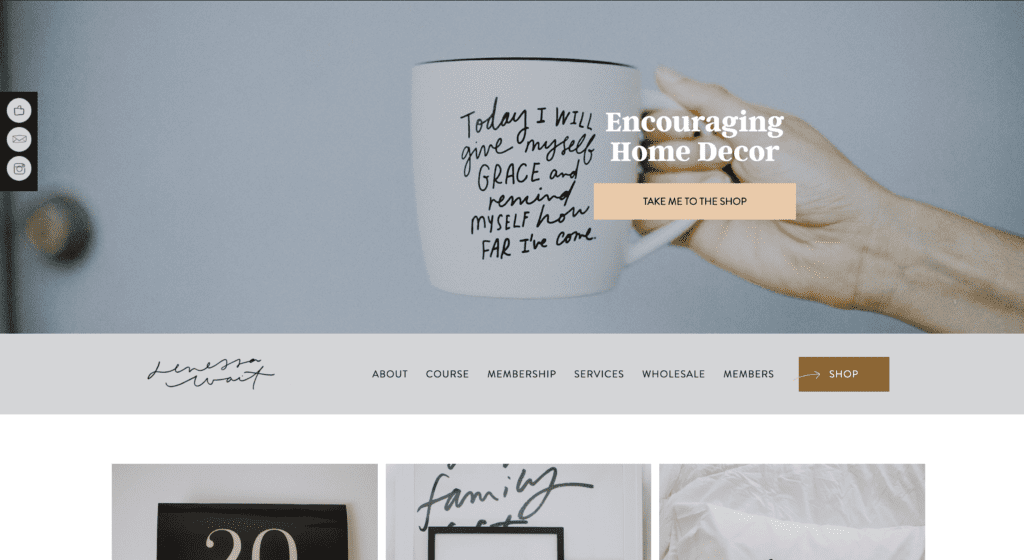
This website feels like such an expression of the artist behind it. Jenessa creates custom hand-lettered designs for products and regularly pulls fresh ideas for banners, icons, and pop-ups from her art into her website. It just goes to show you how truly creative you can be – little details are EVERYTHING!
Make something like it on Weeknight Website…
- Create GIFs for your website banners
- Export hand-drawn .pngs as images and icons to use on your site!
- Integrate your email list on your site
Best Blog Layout
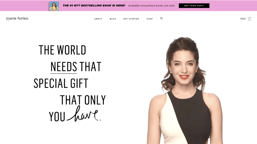
Kristen Loves:
To be honest, Marie is my hero…so I’d probably love her site even if it were a bunch of Times New Roman blue links on a white background. Thankfully, that is not the case and this site is an incredible wormhole to get lost in! The way the Marie TV Archive is segmented (including the little “Marie TV Oracle” feature leads you through what could be a blah-g experience into a Youtube-status binge…on her site!
Make something like it on Weeknight Website (all using Themer Layouts)…
- Create a custom Blog Archive and Single Blog Layouts
- Use the Header and Footer Layouts to make wow-worthy navigation on your site!
- Create a “Part” and place it “Before Header” to make a sleek Notification Bar (you can even include images and a Countdown Timer!)
Fan Favorite
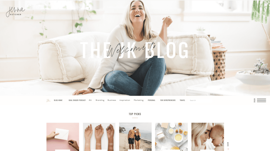
Kristen Loves:
Almost every client I’ve worked within the last 3 years has referenced this site, so I gotta give it a shout out! Every page layout is so beautifully attended to, and the colors welcoming. Even though as you bounce around, you’ll technically find yourself several different sites, Jenna’s brand is so consistent that it never feels jarring to move from her main site to her podcast or her landing pages. Nothing feels random, which makes the most important aspect of this site, its content, truly stand out.
Make something like it on Weeknight Website…
- Get a great brand photoshoot
- Have a clear and consistent color palette
- Use Parallax and Video Backgrounds
- Use one of the Posts modules to create a custom feed of your Blog or Podcasts
Bonus: check out Jenna’s new Podcast Specific site, https://jennakutcherblog.com/goal-digger-podcast/ for more inspiration!
Well, ladies and gents, that wraps this one up for us with a nice neat bow. (See what I did there?)
If you are looking to sharpen your design skills and become an in-demand website designer… we gotchu! Check out how Weeknight Website can help you reach your designer dreams help you launch a biz land grow it while doing what you LOVE… actually!

