If part of your goals for 2020 is to upgrade your website this year, we are proposing a website challenge to help you level up your website design skills and make your site swoon-worthy in the new year.
Websites can easily go stale and look dated if you are not improving them from time to time. We love taking a fresh look at our website every few months just to keep things updated and make sure that we are staying on top of the trends. We also make sure to check our content is updated and reflects our current brand. If you want some content advice we have a whole series with free goodies for you on our Content 101 page.
3 Simple Things to Consider on Your Website in 2020
Here are some of the most popular design trends that we are seeing for 2020 and how you can execute these simply on your website without feeling crazy! ????
Remember that your website is an extension of your brand!
Website Design Tip #1: Break the Grid
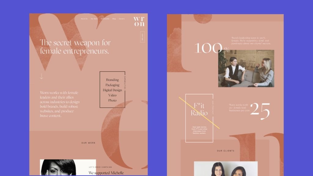
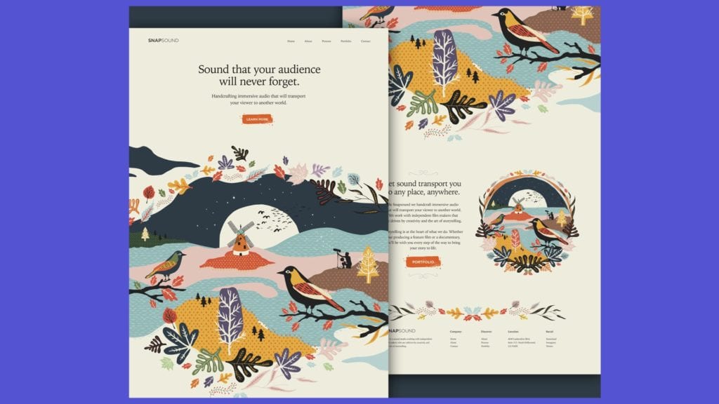
So what does this even mean? When you sign up for a website builder and begin building a site you are going to, by default, get a really boxy feeling layout. The goal of breaking the grid is to think of the page as a whole and not JUST about the individual sections of the page. This helps the reader’s eye travel the page and keep scrolling on your website so that they become immersed in your story and feel compelled to keep reading.
Some great examples of breaking the grid are shown below to give you a feeling for what you can do to add visual interest to your website.
Website Design Tip #2: What the FONT is going on?
Fonts are super important when designing a website. Fonts create a flow within the content that causes readers to recognize when a specific piece of text is important. One of the most common beginner design mistakes that we see, is when someone is new to websites and they change the font hierarchy from page to page and it makes reading the importance of specific pages and information confusing for website readers.
We love to use a mixture of fun and classic fonts that represent our brand well. When you are planning your website branding is the #1 thing that will help you design a beautiful and cohesive site. If you need help with branding, check out our Branding Guide here!
PRO TIP: try not to use more than 3 fonts! ????
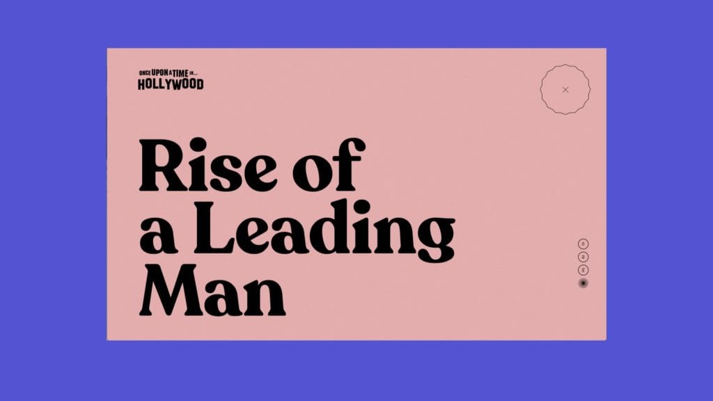
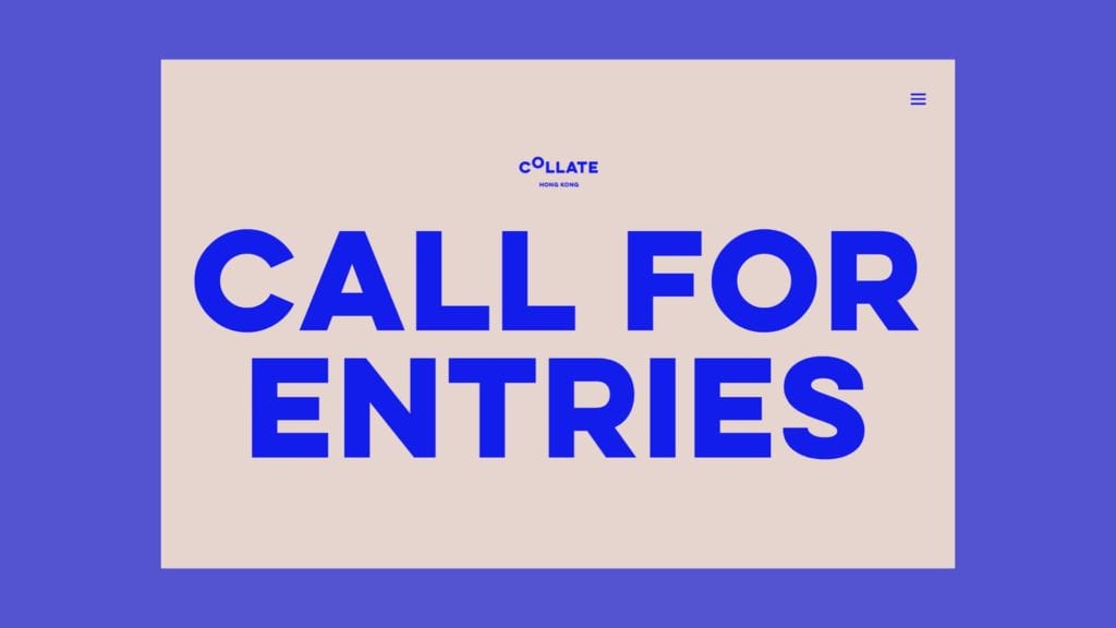
Fun Fact, one of the biggest trends in websites right now is colored backgrounds with BIG and BOLD headlines that are simply type-driven. This is awesome news for those of us with less than stellar photos (or none at all).
Check out some of our favorite examples of this website trend in 2020 below!
Website Design Tip #3: Think About Content
Websites run on content… Everything from Google Search Engines to your users needs your content. While paid ads are a great way to help generate traffic, organic (AKA free traffic) is the best way to actually drive qualified leads.
The more content that you add to your website that is keyword friendly the more likely it is that Google and other search engines are going to send you larger amounts of traffic and keep you in front of readers and BUYERS that are looking for you and what you offer.
If you need help with keyword research we have a free resource for you… Get our completely free guided tutorial on how we do keyword research and rank for some really competitive terms on Google!
psst… we also use this same research to get traffic from Pinterest and Youtube as well. #bonuspoints (Check out the Free Guide + Get the Spreadsheet)
2020 Website Trends to Try… Right Now!
Keeping up with the world best and brightest in the design world can feel intimidating but the good news is we have searched all the new trends and these are some of our faves that are also… super easy to imitate and use in your personal design strategies going into 2020!
2020 Website Design Trends #1: Hand Drawn Elements
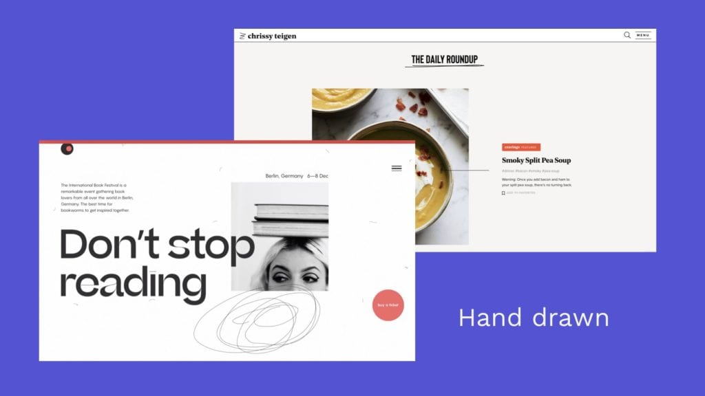
These are super simple to do. If you want to add these to your website you can do a few things…
You can use Canva Pro (one of our fave beginner design tools) and add hand-drawn elements from their stock section and export them as a .png which will make the background transparent so you can lay them over things on your website easily.
You can also draw your own elements on an iPad pro and using an apple pencil add your own amazing and personal touch to your website that will help you stand out from the crowd.
Lastly, we love using Envato Elements for downloading thousands of amazing photos, audio clips, graphics templates (can you say social templates, anyone?!?!), and even exclusive website fonts. and at $33 a month, this is a killer tool for any designer or online profesh to have in their arsenal!
2020 Website Design Trends #2: White Space
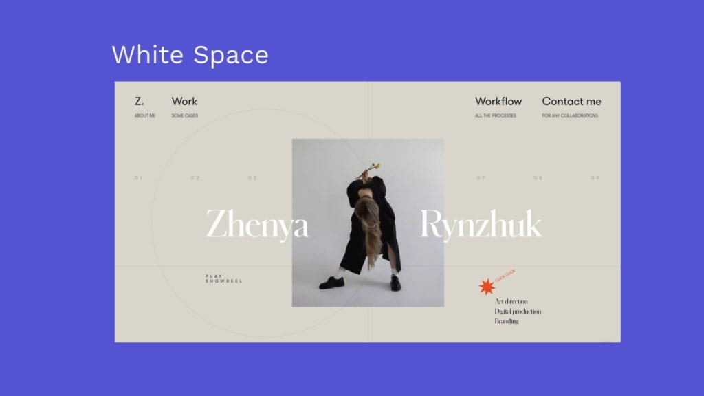
White space is a blank space that leaves space for your eyes to rest and draw attention to the elements you care about the most.
White space allows you to create a pleasing and easy to read and consume site with less busyness and more meaningful content and images that draw the reader in!
Don’t feel like you have to fill every inch of the canvas.
– Kristen Estes
2020 Website Design Trends #3: Microinteractions
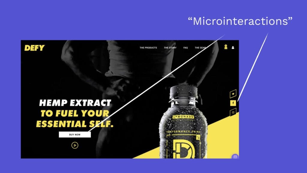
Microinteractions are just what they sound like. Small ways that the person using your site interacts with your site in a fun or unique way that keeps them interested and focused on your website.
Some simple ways that you can add Microinteractions are to add hover effects on your buttons and to include some delayed animations on your images.
Keep in mind that we want to be tasteful and not have too many things going on for your audience. You never want to overwhelm them and leave them confused as to what they need to do on your site. Remember, a confused mind always says no.
Last Tips for Our Favorite 2020 Website Design Trends
Ask yourself these few questions as you review your site to see if there is something you need to change or update.
” Am I guiding my user through my site?”
“Are there flat buttons or clean and boxy lines that I can add some visual interest to?”
“What is the intention of the page and is it clear what the next step is?”

